I was chatting with Jill Bickers and she suggested that thicker chart outlines were preferred by the people reading her charts.
I was curious if Knotions readers had similar thoughts.
You guys chose the thicker outlines
This one isn’t a big surprise. But, you guys never said that you were having difficulty reading or printing our charts.
Regular Thickness
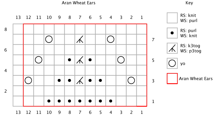
Increased Thickness
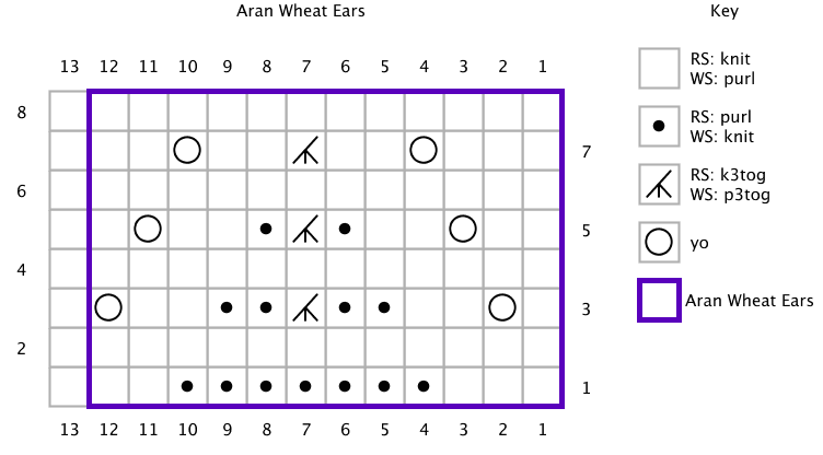
Your Preference
You guys preferred larger charts 20:1 over the thickness we currently have on the site.
It didn’t surprise me that thicker lines was the winner.
But I need to apologize because I didn’t think you’d feel so strongly. Given this though, we’ll start them up in the next issue!
You didn’t mention the color, but I also plan to make them purple. This is because it’s more likely to show on a printout if it’s purple versus red. If you have a black and white printer, the color won’t matter.
But, if you have a color printer, purple will use 2 colors. So, even if you’re out of one color, the other color will still print.
I Don’t Bite
I really hope you guys speak up in the future. I can’t promise that it will change, but I’m pretty sure you’ll feel better!
And, we might even be able to address it. *fingers crossed*
Better….easier to see, but especially helpful when printing a pattern where the print is black and white, not color. When I printed patterns in the past, I have sometimes gone back and used a colored marker to show the repeat because the print was not dark enough. If you use bolder outlines, that will no longer be necessary. (2 thumbs up!)
Thank you! This is exactly what we wanted 🙂
I’m SOOOO glad to hear this!
so like the thicker ones much better
You’re in great company 😉
Thank you for the changes. I never had a problem with the old lines, but the thicker ones were better!
That’s great to hear!
Absolutely no need to apologise – you asked us to choose an option and we did but it was NOT because of difficulty reading the original. Must add though that I like the lovely vibrant red shade you’ve been using, but I assume that red might be difficult for some readers to see.
thanks 🙂 I never thought of it as “good” but even better. That’s nice to hear!