I’m learning so much through this process! Color has such an impact. I knew it did, but wow these pics are really showing it to me.
Ok, let’s jump in to today’s designs.
London Calling Cowl
I’ll admit it. London Calling was a tough one to do and I honestly don’t think it’s showing a wide range of options. I did try to stay true to the original and used one lighter shade that pops.
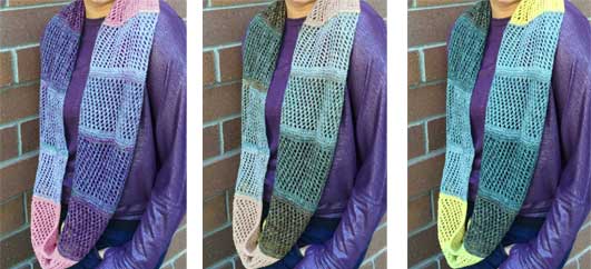
It’s funny. I thought the purple shades would be a great complement to the purple shirt, but I like the contrast better in the original. See? I told you – I’m learning a lot.
Hive Mind Hat

I like all these Hive Mind Hats. They’re very different from each other and yet they all draw me in for different reasons.
You know what I find the most interesting though? How the model’s face coloring changes depending on the color of the hat. In some pics it looks mellow and in others it pulls out the pinks in her cheeks a bunch.
Again, it’s showing us how much of an impact color can have. Not just in what we like, but also how we look in it.
Closing out the series
This was a fun exercise for me and I hope for you too. I knew I’d enjoy seeing the designs in different colors but I didn’t expect to get other learning from this as well.
What about you? What have you learned from this?
And just remember, since this is Part 3, here’s Part 1 and Part 2 as well.
Gray is a versatile color. It can be paired with any other color, and if the tones are just right, both colors vibrate. I’ve got tons of gray yarn, some of which I’m now working up with a pink variegated to make a striped shawl that every other knitter (including me) has already made in a gradient.