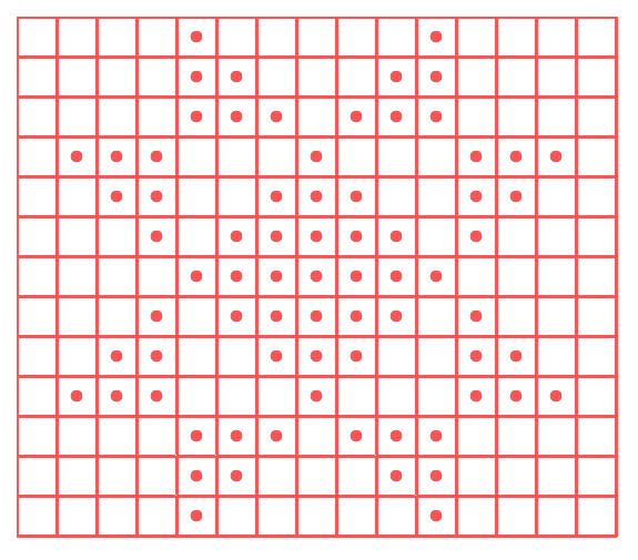
Have you noticed that charts don’t have the proper proportions to reflect an actual stitch’s width and length?
Here are a few examples
Let’s look at the chart for the Textured Danish Rose, done with squares:

And, a truer chart:

You see how the one on the bottom – the truer one – looks like it’s been pinched so that it’s shorter? And here’s both of them together:

The regular chart (in red) has THREE more rows in it! It’s around a fourth larger. That’s A LOT.
I’ve always been a big proponent of charts that show us true pictures. If you’re working on cables, you’re more concerned about which pieces hop over which. But if you’re doing texture or colorwork, you’ll want the chart to accurately reflect what’s going to be knitted.
A Quick Fix
If you’re just trying to get a more accurate depiction of what’s charted, if you can squash the rows by about 25%, that should get you closer.
And please note that the 25% isn’t accurate for garter stitch. In this case, a stitch is roughly half as tall. Meaning that a “regular” chart is even less correct when showing garter stitch.

Has Your Mind Been Blown Yet?
You may be wondering why I’m telling you all of this.
It’s good to keep these in mind – especially when you’re trying to do things so that it would look accurate. For example, you can’t just take a counted cross stitch chart and translate it 1 for 1 in knitting.
You’ll likely have a need for this at some point. And until then, just keep it in your back pocket.
About the Instructor: Jody Richards

Jody is the founder and lead editor of Knotions. She loves poring over stitch dictionaries and trying out new stitches.
She’s also on a mission to get everyone to embrace the blocking. And, to avoid using garter stitch edges in knit swatches made for gauge.
And while she likes all things crafting (well ok, except that one thing), yarn crafts are her true love (and she has the stash to prove it).
Yes!!! Thank you!! That is why I always use rectangles in my charts and don’t like the square ones 😉
No surprise that we’d agree here 🙂
But you’re in the minority – there are just too many things that use squares. I don’t think it’ll change outright.
Having said that, I APPLAUD you for doing it. It really shows a truer picture.